Charts and Objects in Spreadsheets
Senior 3 · ICT
Charts and Objects in Spreadsheets
Lesson 3 of 5
45 min
The school's weather club measured the rainfall in its rain gauge every month for a year (the figures below are illustrative). Excel's first chart of them had a title that said “Chart Title”, tiny grey labels, an axis that ran to 180 with no units, and colours that disappeared when printed in black and white. Nothing was wrong with the data; everything was wrong with the design.
| Month | Jan | Feb | Mar | Apr | May | Jun | Jul | Aug | Sep | Oct | Nov | Dec |
|---|---|---|---|---|---|---|---|---|---|---|---|---|
| Rainfall (mm) | 78 | 92 | 128 | 165 | 104 | 22 | 9 | 31 | 74 | 112 | 134 | 88 |
This lesson turns a draft into a chart worth printing: the right type, a clear layout, readable fonts, sensible colours, and an honest axis.
Definition
Chart layout: the arrangement of a chart's elements (title, legend, axis titles, data labels). Quick Layout applies a ready-made arrangement in one click.
Chart style: a ready-made set of colours, fills and effects for the whole chart.
Axis scale: the range and spacing of the numbers on the value axis, set by its bounds (minimum and maximum) and its units (the major unit is the step between labels and gridlines).
Combo charts. To show two different measures together, choose Combo in the same dialog. For example, rainfall as columns and average temperature as a line, with the temperature series ticked as Secondary Axis, so it gets its own scale (°C) on the right.
Switch Row/Column. For the science-fair tickets of the last lesson, Excel grouped the bars by class with one colour per day. Chart Design → Switch Row/Column groups them by day instead, with one colour per class. The data are the same; the question the chart answers changes: “how did each class do?” or “how did each day go?”.
| To change | Do this |
|---|---|
| The whole arrangement | Chart Design → Quick Layout, then point at Layout 1, 2, 3 … to preview it |
| One element | Chart Design → Add Chart Element, or the + button |
| The overall look | Chart Design → Chart Styles gallery |
| The colour set | Chart Design → Change Colors: Colorful or Monochromatic palettes |
| One series | Click a bar once (the whole series is selected) → Format → Shape Fill |
| One single bar | Click it once, then once more (only that point is selected) → Shape Fill |
| All the chart's text | Click the chart's border (Chart Area) → Home → font and size |
| Only the title | Click the title → Home → font, size, bold |
Double-click any element and the Format pane opens on the right with every setting for it: fill, border, size, and for axes, the scale.
Mock-up drawn by Ganzaa. With these settings the axis reads 0, 50, 100, 150, 200.
Worked example 1: a scale for the rainfall chart
The highest month is April, 165 mm. Excel chose a maximum of 180 and a major unit of 20, which crowds the axis with ten labels. The club wants round, readable steps.
The minimum bound is the most dangerous setting. Here are the same two pass rates, 82% and 86%, drawn twice:
Charts drawn by Ganzaa; the pass rates are illustrative.
Worked example 2: how big is the distortion?
With the axis from 0, the bars' heights are in the ratio : School Y's bar is about 5% taller, which is true to the data. With the axis from 80, the visible heights are and , a ratio of . A difference of 4 percentage points now looks like “three times better”.
Rule: bars and columns start at 0. A line chart may start above 0 when the reader cares about small changes (for example a body temperature of 36 to 39 °C), but the axis must be clearly labelled.
Tip
Design for every reader
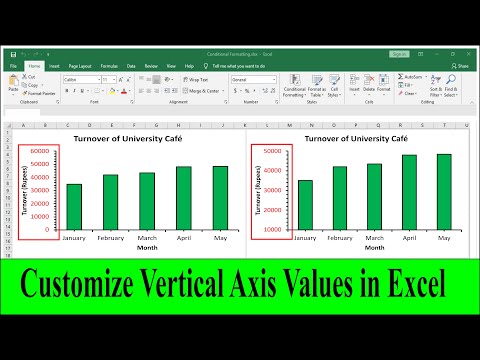
Teaching Junction: how to change the vertical axis maximum, minimum and major units in Excel, using the Format Axis pane.
Open S3_Charts.xlsx and add a sheet called Rain with the rainfall table above (months in A2:A13, rainfall in B2:B13, headings in row 1).
Practice
Sources and credits
This lesson adapts CC BY-SA material and is shared under CC BY-SA 4.0.