Colour Wheel Presentation
Senior 3 · Fine Arts
Colour Wheel Presentation
Lesson 4 of 4
25 min
In September 1888 Vincent van Gogh set up his easel in a square in Arles, in the south of France, and painted a café at night. Look at the photograph below before you read on. The awning and the lit terrace are a hot yellow-orange. The sky above is a deep blue, close to blue-violet. Neither colour would glow so strongly on its own. They glow because they are opposite each other on the colour wheel you built in Lesson 3. In this lesson you will learn to use two relationships on that wheel: complementary colours, which fight for attention, and analogous colours, which sit quietly together.

Definition
Colour scheme (colour harmony): a planned group of colours chosen because of where they sit on the colour wheel. Example: a poster using only blue, blue-green and green.
Complementary colours: two colours that lie directly opposite each other on the colour wheel, six segments or 180° apart. Example: orange and blue.
Analogous colours: three to five colours that lie next to each other on the colour wheel, within about a quarter of the circle. Example: yellow, yellow-green and green.
Simultaneous contrast: the way a colour seems to change when it is seen beside another colour. A colour looks most intense next to its complement.
Neutralise (dull, or "knock back"): to lower the brightness (saturation) of a colour by adding a little of its complement.
On a 12-part wheel every colour has exactly one complement, the colour six segments away. The table lists all six pairs. Notice the pattern: each primary is opposite the secondary made from the other two primaries (red is opposite green, and green is yellow + blue, with no red in it). Each tertiary is opposite another tertiary.
| Colour | Its complement | Type of pair |
|---|---|---|
| Yellow | Violet | primary and secondary |
| Red | Green | primary and secondary |
| Blue | Orange | primary and secondary |
| Yellow-orange | Blue-violet | tertiary and tertiary |
| Red-orange | Blue-green | tertiary and tertiary |
| Red-violet | Yellow-green | tertiary and tertiary |
Complements behave in two opposite ways, and a painter uses both.
Analogous colours are neighbours. Because each one shares a parent colour with the next, they blend smoothly and give a calm, unified feeling. Look at a hillside in the rainy season: yellow-green young grass, green trees and blue-green shadows. That is an analogous scheme found in nature.
An analogous scheme works best when you give the colours different jobs:
Analogous schemes can be warm (for example yellow, yellow-orange, orange, red-orange) or cool (for example green, blue-green, blue, blue-violet). If an analogous design looks flat, add a small accent of the complement of the dominant colour.
Your finished wheel from Lesson 3 is the centrepiece of the presentation. Beside it, add a panel that shows you can use the wheel:
Worked example 1: finding a complement by counting
Find the complement of red-violet.
Step 1 List the wheel in order, starting at yellow: yellow, yellow-orange, orange, red-orange, red, red-violet, violet, blue-violet, blue, blue-green, green, yellow-green.
Step 2 The complement is six segments on: violet (1), blue-violet (2), blue (3), blue-green (4), green (5), yellow-green (6).
Step 3. Check. Six segments of each make , half a turn, so the two colours are opposite. Red-violet contains red and blue; yellow-green contains the missing primary, yellow. The pair is red-violet and yellow-green.
Worked example 2: choosing a scheme for a purpose
Ineza is painting two things for her school: a sign for the health club that must be seen across the playground, and a mural for the quiet reading corner. Which scheme suits each?
Sign. It must catch the eye, so use complements. She chooses a blue background with orange letters. To stop the pair fighting, she lets blue cover most of the board and uses orange only for the words.
Mural. It should feel calm, so use analogous colours. She chooses a cool run: blue-green (dominant, for the sky and water), green (supporting, for the trees) and blue (accent, for small details).
Check. Orange and blue are six segments apart: complementary. Blue-green, green and blue are three neighbours: analogous.
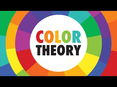
<em>COLOR THEORY BASICS: Use the Color Wheel & Color Harmonies to Choose Colors</em>, from the Sarah Renae Clark channel. Watch the parts on complementary and analogous harmonies, and compare her wheel with yours. She also shows other schemes, such as triadic, that go beyond this lesson.
Warning
Equal amounts of two strong complements clash. Full-strength red and green in equal areas seem to flicker where they meet and tire the eye. Let one colour dominate, or dull one of them slightly with its complement.
Accidental mud. A brush that still holds red will turn a green mix brown, because you have mixed complements without meaning to. Rinse fully between colours.
Tip
Opposite to shout, neighbours to calm. Complements are 6 steps (180°) apart; analogous colours are next door, within 3 steps (90°).
Practice
Name the complement of: (a) blue; (b) yellow-orange; (c) green.
Which of these groups is analogous: (a) red, green, blue; (b) blue, blue-violet, violet; (c) yellow, violet, orange?
Explain why a primary's complement is always a secondary.
A painted banana leaf looks too bright and artificial. Which colour should you add, in small amounts, to make the green look more natural, and why is this better than adding black?
Plan a warm analogous scheme of four colours for a poster about a harvest festival. Say which colour is dominant and which is the accent.
Look again at Café Terrace at Night. Name the main complementary pair and explain what it does for the painting.
Practical. Make the neutralising strip for your presentation, from blue to orange, in five squares. Describe the middle square.
1. (a) orange; (b) blue-violet; (c) red.
2. (b): blue, blue-violet and violet are neighbours on the wheel. Group (a) is the three primaries, and (c) contains yellow and violet, which are complements.
3. A primary's opposite point lies halfway between the other two primaries, and the colour halfway between two primaries is the secondary mixed from them. For example, blue is opposite orange, which is red + yellow.
4. Add a little red, the complement of green. It lowers the brightness while keeping the colour warm and natural; black tends to make greens look dirty and cold.
5. For example: yellow-orange (dominant), yellow (supporting), orange (supporting) and red-orange (accent). Any four neighbours from yellow to red are acceptable if the roles are given.
6. Yellow-orange (the awning and terrace) against blue to blue-violet (the sky). Set side by side, each makes the other look more intense, so the lit café glows against the night and draws the eye.
7. The middle square should be a dull brownish grey: neither clearly blue nor clearly orange.
Look at the colours in your classroom or school compound. Find one place where complementary colours are used and one where analogous colours are used. Which one was chosen to attract attention, and which to create a calm feeling?
Further reading
Sources and credits